
Incorporating Feedback: Enhancing the User Experience of My Website
- Bettina Eiben Künzli
- 24. Feb. 2024
- 1 Min. Lesezeit
Aktualisiert: 14. März 2024
2024-02-24
Today, I reached out to three fellow students and one faculty member for feedback on my website. Magdalena Tomoff, a MAD Design Student in her final semester, was one of the respondents. She promptly provided constructive support and offered to assist further within a week. Although she has not explored the content in-depth yet, she shared her initial impressions of the site's logic and structure.
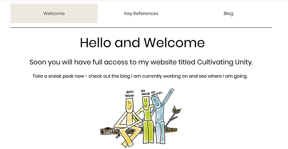
Magdalena appreciates the initiative to showcase my project through a website, recognising its supportive and record-keeping capabilities for my progress. She suggests enhancing the site with more images and recommends using a thematic image, such as a garden, as a welcoming page. This approach, coupled with the inclusion of the thesis title, would provide visitors with immediate clarity on the site's purpose and the project's focus.
Additionally, Magdalena advises integrating elements of the thesis project into the welcome page to establish a clear connection with the topic. She emphasises the importance of documenting the process with images, dates, and concise text to maintain a logical sequence and facilitate readability. Currently, the absence of a clear logical sequence or timeline makes it challenging to navigate the site effectively.
Incorporating Magdalena's feedback will not only enhance the user experience but also ensure that visitors can easily understand the purpose of the website and the progression of the project. By implementing these suggestions, I aim to create a more intuitive and engaging platform for sharing my research journey.
So, I started already by implementing her suggestions into the Blog Articles. As of now, the entry date of the post comes always first.


Kommentare